UI Layout! More Combat UI!
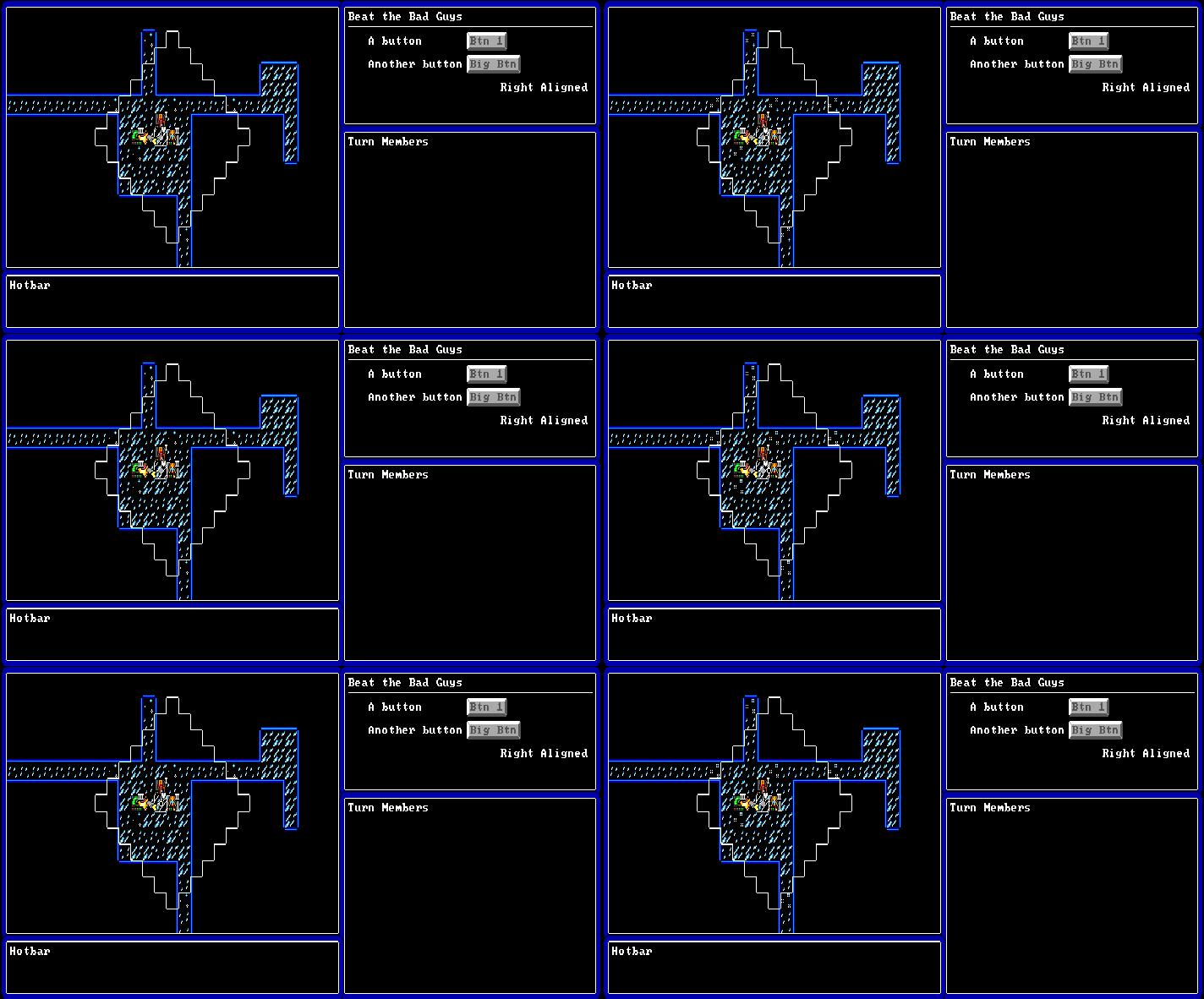
 Finally took a minute to lay out the basics of the normal gameplay UI using my “EGAUI” ImGui-facsimile
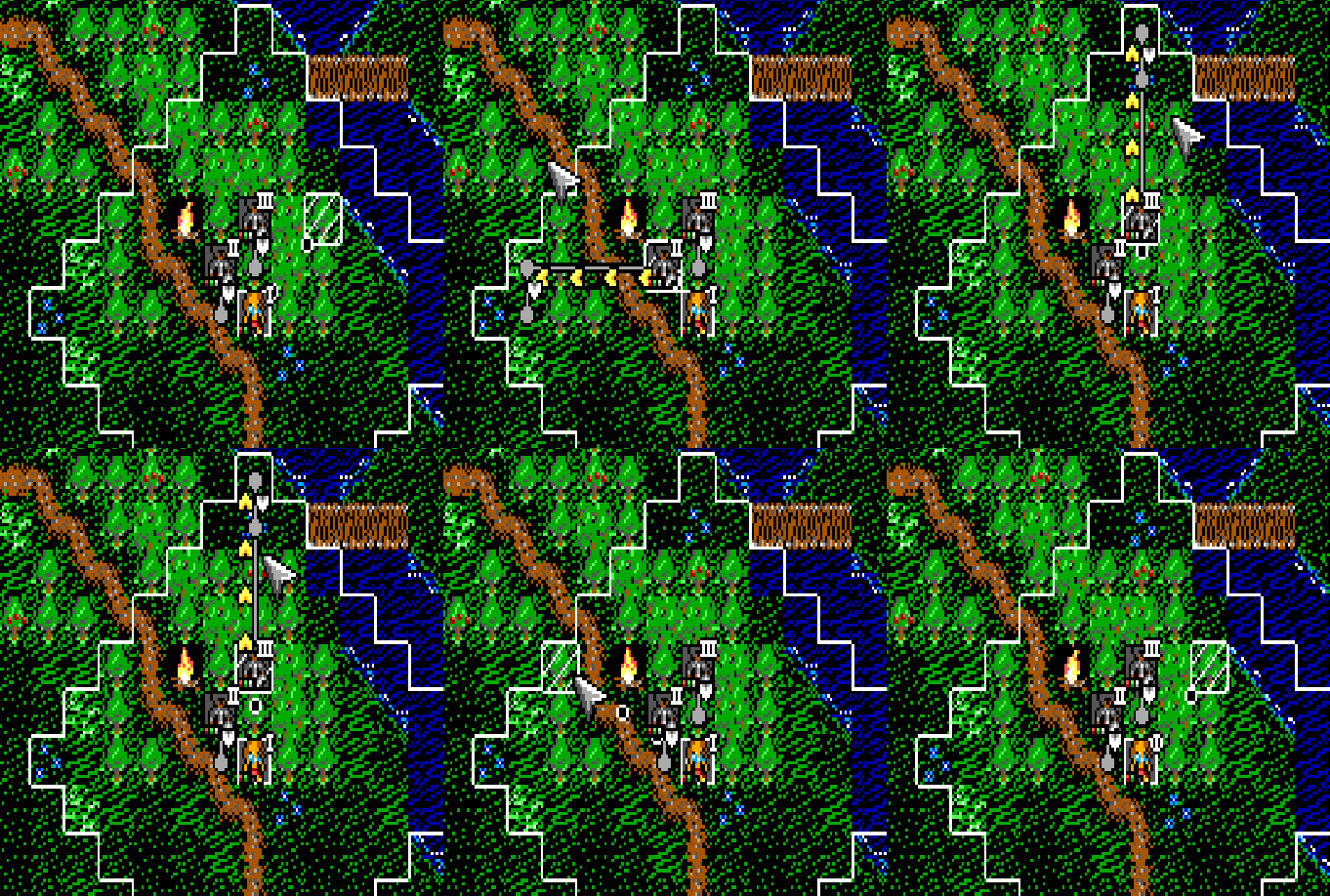
Here we get an idea of the actual full resolution of the game and why I worry constantly about things being readable. The combat UI has also gone through another iteration, can you guess how this turn will play out? I'm still not totally happy but it continues to get to a better and better place.
One of the new inventions is a grey graph-node graphic that shows the expected positional changes of the actors to make it clearer where they'll be acting from:

 Wishlist Chronicles IV: Ebonheim!